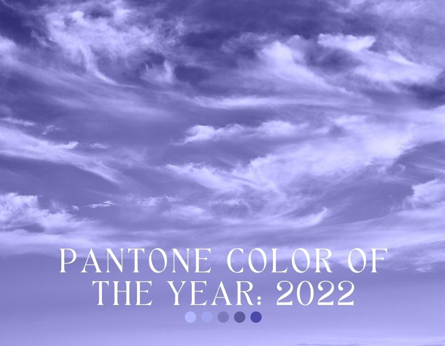
2022 Pantone Color Of The Year
Posted by MELISSA EVANS

Pantone releases a color of the year every year, which creates significant buzz across the design community. With this ever-changing desire for creating something different comes new energy and creativity, making brands as well as designers eagerly anticipate the announcement of Pantone's annual color with each new release. Learn more about this "color of the moment" in our blog article!
What is the Pantone color of the year?
Pantone's Color of the Year is a highly anticipated event in the design world. Every year, Pantone announces a new color that they believe will be on trend in the coming year. This color is then used by designers and brands to create products and marketing materials.
While the Pantone Color of the Year is not necessarily an indicator of what colors will be popular in general, it does give us a good idea of what direction design is headed. For example, last year's colors, Ultimate Gray and Illuminating, represent a story of color that encapsulates deeper feelings of thoughtfulness with the promise of something sunny and friendly.
This year's color is Very Peri, an intense purple, inspired in part by the metaverse. Pantone says that Very Peri "displays a spritely, joyous attitude and dynamic presence that encourages courageous activity and imaginative expressions."
So what does this mean for designers? Expect to see more purple in design this year, especially in branding and advertising. Very Peri can also be used to add a sense of luxury or sophistication to your everyday life.
How is this color related to our favorite things in every day life?
How is this color related to our favorite things in everyday life? Well, according to Pantone's Executive Director Leatrice Eiseman, Very Peri is an innovative color that can help us communicate, express ourselves, and connect: “Creating a new color for the first time in the history of our Pantone Color of the Year educational color program reflects the global innovation and transformation taking place. As society continues to recognize color as a critical form of communication, and a way to express and affect ideas and emotions and engage and connect, the complexity of this new red violet infused blue hue highlights the expansive possibilities that lay before us”.
There are a few key reasons why the Pantone Color of the Year is so important. First, it’s a great way to stay ahead of trends. The Color of the Year is usually a reflection of what’s happening in the world, and can be an early indicator of upcoming trends. Second, it’s a great way to add some freshness to your everyday life (especially if you're in the creative field!). If you feel like your designs are starting to look a little stale, try incorporating the Color of the Year into your work. It can help give new life to your designs. Finally, it’s just fun! Trying out new colors can be exciting and rewarding, so why not experiment with the Color of the Year? Here are some examples:
- Use it as an accent color in your home! Try adding a throw pillow or even designing your own painting in Very Peri. This will freshen up your home and give it flair, without making any big changes.
- Wear it loud and proud! Adding just a few new pieces of clothing in this fantastic color can brighten up your entire wardrobe.
- Make it your own! A great idea would be getting new accessories in this beautiful color, like bracelets, earrings, or necklaces.
Very Peri Jewelry Trends
If you're looking for an easy way to include this magical color in your everyday life, we have a few solutions for you:
- Purple Cork Copper Side Hook Bracelet: This bracelet is so easy to put on and off and is one of our most popular unisex bracelets!

- Purple Cork Silver Open Hook Bracelet: This best selling design is one of our personal favorites and it's easy to see why!

- Marquis Druzy Sterling Silver Necklace: This beautiful druzy quartz pendant is electroplated in sterling silver and comes available in blue, green, purple, and pink.

Whether you're looking for inspiration or simply want to spruce up your style, Very Peri will definitely help out! Start adding this color to your everyday life today and let us know what changes you notice. We love hearing from you!

